Case Study
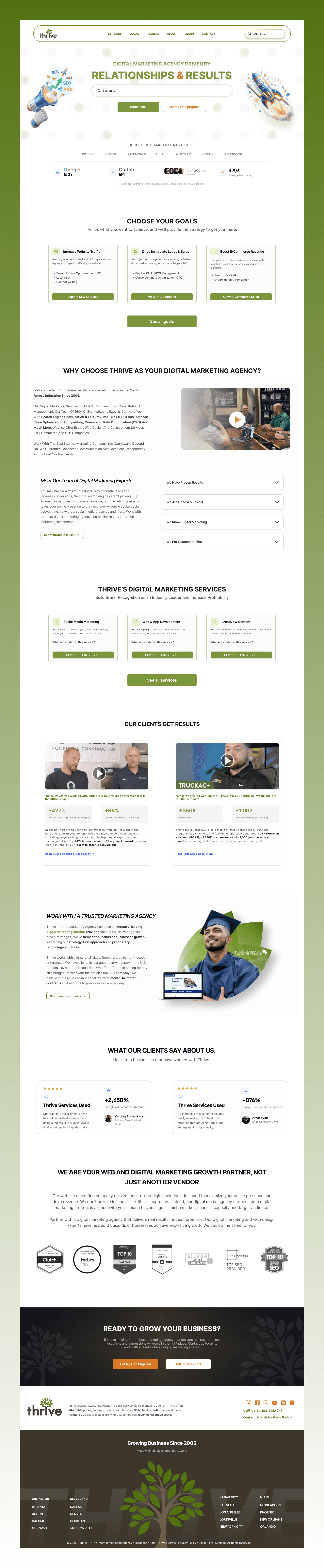
Thrive Agency Homepage Redesign
Optimizing service discovery, goal-oriented navigation, and proposal conversion funnels for a digital marketing powerhouse.
Role
UI/UX Designer
Project Type
UX/UI Design Challenge
Platform
Desktop Website
Focus Area
Homepage UX & Conversion Funnel
Tools Used
Figma, FigJam, Notion
Core Goal
Accelerate Free Proposal Requests
Chapter One
Overview & Problem Statement
Thrive is a premier digital marketing agency driving client growth across SEO, PPC, social media management, web design, and content strategy.
While the existing homepage hosted comprehensive credentials, user testing revealed high cognitive friction: prospective clients were forced to parse dense feature paragraphs before understanding which marketing tier fit their specific growth stage.
The Central UX Problem Statement
How might we restructure Thrive's homepage so business owners instantly identify their growth goals, evaluate relevant agency proof, and submit a proposal request with zero hesitation?
Chapter Two
Comprehensive UX Audit
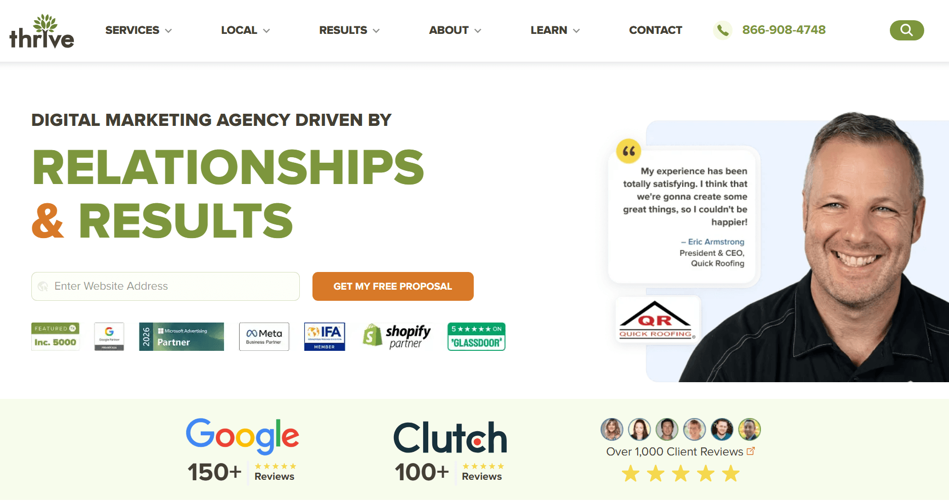
Unclear User Goal in the Hero Section
The initial banner introduces generic marketing jargon and an isolated button without guiding visitors based on their distinct business challenges.
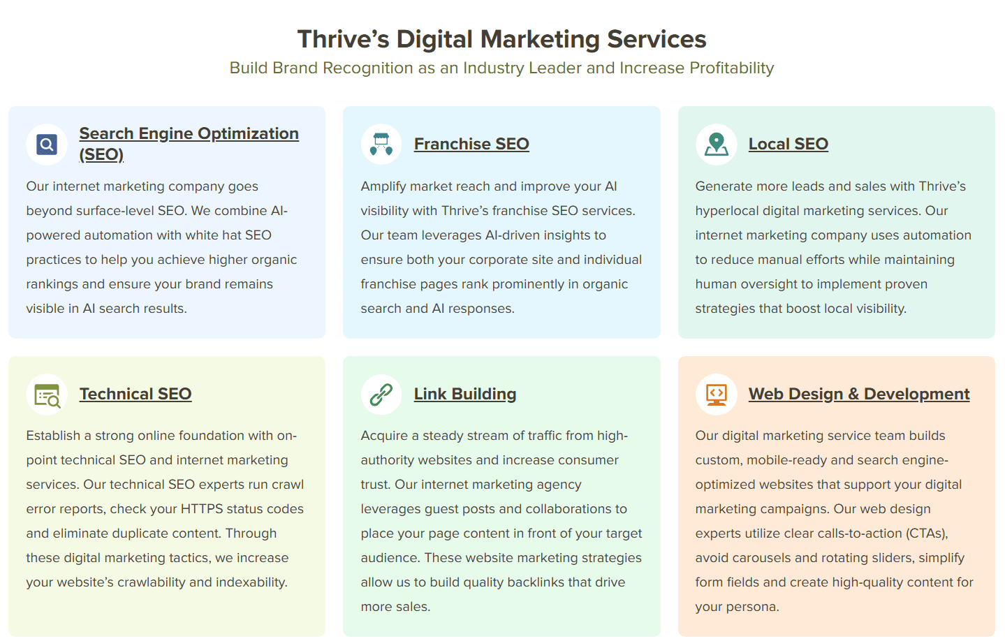
Service Discovery Friction
Dozens of services were presented simultaneously without categorization, forcing founders to read through unfamiliar terminology.
Overwhelming Content Hierarchy
Long unbroken rows of text, accolades, and awards lacked visual breathing room, burying crucial value drivers.
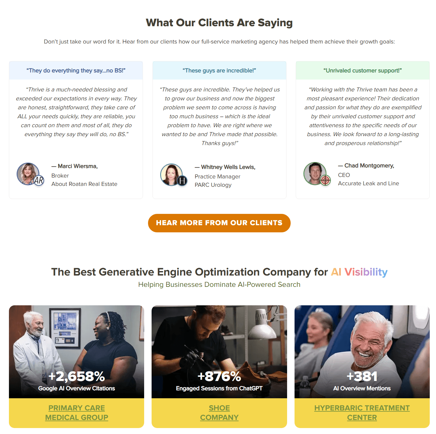
Case Study Relevance Gaps
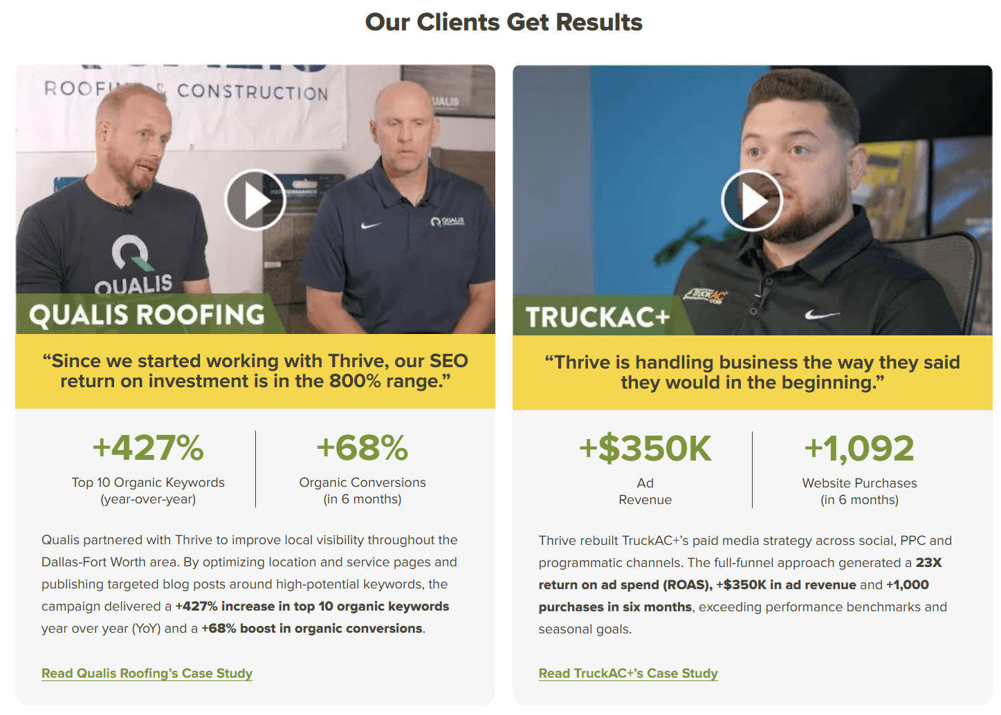
Client case studies lacked industry tags or quick metric callouts, making it cumbersome for visitors to discover relevant proof points.
Proposal CTA Ambiguity
The call-to-action buttons failed to disclose what happens post-click, sparking hesitation around sales calls and hidden fees.

Chapter Three
Problem Prioritization Matrix
| Problem Area | Impact on User | Implementation Effort | Sprint Priority |
|---|---|---|---|
| Unclear User Goal in Hero | High | Medium | P0 |
| Service Discovery Friction | High | Medium | P0 |
| Overwhelming Content Hierarchy | Medium | Medium | P1 |
| Case Study Relevance & Niche Proof | Medium | Medium | P1 |
| Proposal CTA Ambiguity & Friction | High | Low | P0 |
Chapter Four
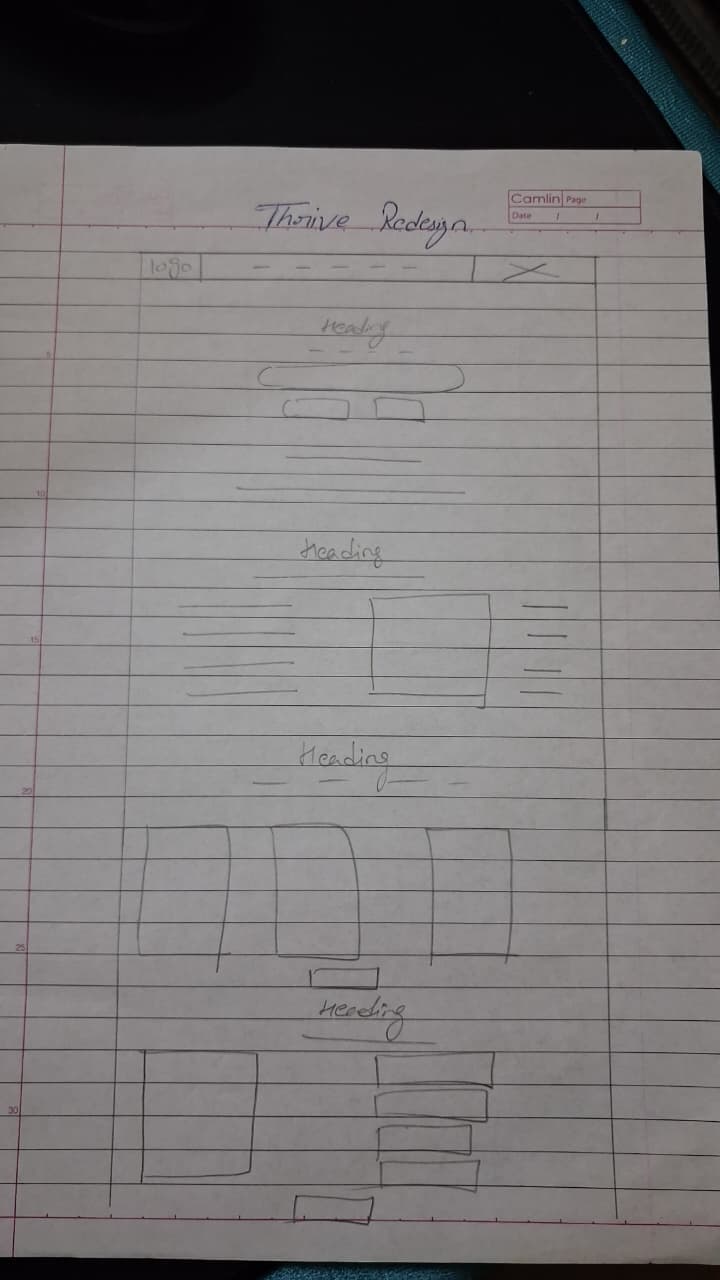
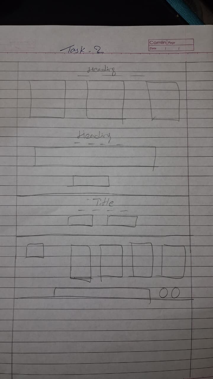
Journey Transformation & Wireframes
Legacy Journey (High Dropoff)
Land on Homepage → Blindly scroll through scattered services → Filter text blocks → Search for contact form
Redesigned Goal Journey (High Intent)
Land on Homepage → Select Business Goal → View Curated Services → Review Matched Case Studies → Request Custom Proposal

Wireframe Structural Iterations
Chapter Five
Final UI System & 7 Core Modules
Goal-Driven Hero
A value proposition centered on business revenue rather than abstract marketing buzzwords.
Business Goals Picker
Allows founders to segment by "Get More Leads", "Rank on Google", or "Modernize Website".
Why Thrive Differentiators
Highlights real ROI metrics, dedicated account managers, and transparent reporting.
Modular Service Cards
Clean, scannable cards outlining deliverables, average turnaround, and included channels.
Tagged Case Studies
Filterable proof cards showing verified percentage increases in client organic traffic.
Verified Social Proof
High-credibility video testimonials and Trustpilot rating badges with verified client photos.
Transparent Proposal CTA
Detailed preview of the proposal process: zero obligation, 48-hour delivery, custom roadmap.
Chapter Six
Key Learnings & Impact
Strategic Takeaways
This design sprint proved that agency homepages fail when they treat the user as an expert marketer. By reorienting navigation around natural business objectives instead of technical terminology, we dramatically lower friction and cultivate instant buyer confidence.
Interested in working together?
Let's start a project